
The colors you choose for your restaurant’s furniture aren’t just a design choice; they profoundly impact your customers’ dining experience. Restaurant color psychology is vital in shaping perceptions and influencing behavior, including what, when, and how much we eat.
In today’s post, we will discuss some of the best colors for restaurants and their impact. Let’s get started.
Restaurant Color Psychology
Here are some of the best colors for different themed restaurants. Use this color psychology while designing your restaurant interior.
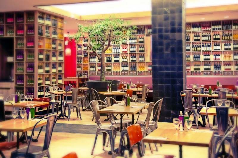
1. Red: This bold color is known for arousing the senses, including the appetite. It’s a popular choice for fast-food restaurants. It creates a sense of urgency, encouraging quick decisions and faster eating.
3. Yellow: This is one of the most eye-catching colors. Yellow evokes happiness and optimism. While it can also stimulate appetite, using too much can be overwhelming and lead to discomfort.
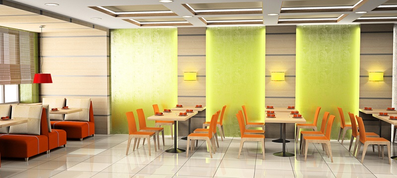
2. Orange: The combination of red’s urgency and yellow’s cheerfulness results in orange. It is a welcoming and energizing color. This color promotes social interaction, making it great for casual dining spaces.
4. Green: This color often symbolizes health and well-being. Restaurants with health-conscious menus frequently use green to align with their offerings and create a relaxed atmosphere.
5. Brown: Brown gives off feelings of earthiness and comfort. It’s a solid choice for restaurants aiming for a rustic or homely vibe, like farm-to-table establishments.
6. Blue: Blue is a calming color. However, blue is one of the least appetizing colors. While some seafood restaurants use it to match their theme, it’s not a common choice for most dining spaces.
7. White: Clean, simple, and neutral, white can make a space open and fresh. However, too much white can make a space feel sterile, so it’s usually balanced with other colors.
8. Black: Black exudes sophistication and luxury. It’s often used in high-end dining establishments to set a formal mood.
From Walls to Furniture: The Influence of Restaurant Color Schemes on Customers
You have already understood various colors’ significance and how they can make their mark in your restaurant’s dining space. Now let’s have an idea of which colors go well with each other and how to create a beautiful color scheme for your restaurant.
Light Colors:
Colors like white, beige, and light grey make a space look larger. They reflect light well and can make a dining area feel more open. These shades are ideal for cafes or bakeries where a casual, airy vibe is desired.
Dark Colors:
Shades like brown, purple, navy, and dark green make spaces appear smaller and cozier. They’re perfect for creating an intimate setting suitable for romantic or high-end restaurants.
Warm Colors:
These colors include shades like yellow, orange, red, and gold. They’re good at stimulating energy and comfort. Thus, these are suitable for family dining spots and fast-food restaurants.
Earthy Color Scheme:
Earthy colors like brown, olive green, beige, and dark orange provide a sense of connection to nature. They work well in establishments focusing on organic or health-conscious menus.
Pastel Color Scheme:
Soft shades like sky blue, pink, light yellow, and pale green have a calming and soothing effect. They’re ideal for dessert cafes or tea rooms where guests want a relaxed experience.
Finding the Right Furniture Color for Your Restaurant or Bar
Let’s dive deeper into this section.
Selecting the right furniture color isn’t just about what you like; it’s about creating a cohesive customer experience. First, consider your restaurant’s theme. Is it a rustic farmhouse vibe, a sleek modern look, or perhaps something exotic? Your Restaurant furniture should enhance that theme. For instance, dark mahogany might suit a high-end steakhouse, while pastel colors may be perfect for a beachside seafood spot.
The clientele you’re targeting also plays a crucial role. Families with young kids might find bright, playful colors more inviting, while a mature crowd might appreciate a more subdued palette.
The emotional impact of colors shouldn’t be overlooked. As mentioned before, some colors can influence people’s emotions and actions. If you’re aiming for a relaxed dining experience, blues and greens can be excellent choices for your furniture. On the other hand, if you want a vibrant, energetic bar atmosphere, consider using bold shades like red and orange.
Practical concerns are also essential. Lighter colors might show wear and tear or stains more efficiently, while darker colors can be more forgiving. When picking furniture colors, think about long-term maintenance. Consider the colors that are easier to keep clean. You can also choose the colors that will best hide the inevitable spills and scuffs.
Finally, don’t forget comfort. Color psychology suggests that certain colors can affect how comfortable people feel. Warm colors make spaces feel cozy and inviting, while cool colors offer a sense of calm and openness. You want your patrons to feel at ease so they’re more likely to stay longer and come back again.
Conclusion
Ultimately, your restaurant’s color scheme is more than a design choice; it’s a business decision. The colors you pick can influence customer behavior, affecting how long they stay, what they order, and even how much they spend. Whether opening a new restaurant or considering a renovation, remember that color is a powerful tool that can impact your establishment’s success.
Make informed decisions by understanding color psychology and entertaining your target audience, the dining atmosphere you aim to create, and the practicalities of long-term maintenance. It’s not just about aesthetics; it’s about strategy.
FAQs
The best wall colors depend on the restaurant’s vibe and target audience. Warm tones like red and orange boost appetite and energy, making them good for casual eateries. Cooler shades like blue and green evoke calmness, ideal for fine dining. Neutral colors offer flexibility and a clean backdrop.
Warm colors like red and yellow are generally the most appetizing. These shades stimulate the senses and grab attention, making the food appear more appealing. They often evoke feelings of warmth and comfort, encouraging people to eat more. It’s no surprise you’ll find them frequently in food advertising.
